ToolTipText: -
Similarities similar.htm - Classical correlations
are used for constructs but Slater clipped/expected distances are used
for elements.
Throughout the system, for ease of printing, the bitmap tables and corresponding narrative, as shown here, can either be shown in color or monochrome depending on whether the View > Monochrome Ctrl+M menu is checked.
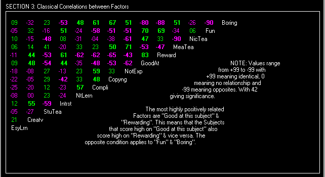
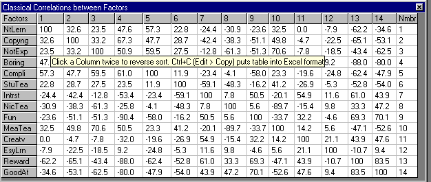
In these two sections they are sorted twice to show the highest absolute correlations whether positive or negative. However, the text tables which are put onto the system clipboard by using the Edit > Copy Ctrl+C command are not double sorted and are classical full matrix tables. You can sort these tables on any single particular column.
The section 3 screen is one of the more interesting because it allows you to test the meaning of the words used to describe the constructs. We can see here that Sally's definition of "Boring" was anything that is not "Fun", that she does not get "Rewarded" at and she isn't "Good at". These meaningful definitions strengthen your belief that the data provided is valid and not contrived or random. Sometimes, not so readily acceptable relationships are shown and these you can come back to later in your interpretation (i.e. here we see Not Explained correlating with Mean Teacher).
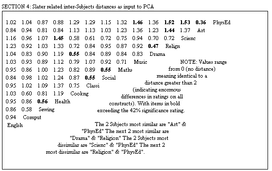
If any significant relationships show up here in section 4 then you should re-think the problem and ask "What is it that makes THIS different from THAT?" or "In what ways are THEY similar?" (assuming a large distance). The table is made up from Slater's inter-element distances that range from 0 (no distance) to a distance greater than 2 (normal diameter, but some skewed grids show greater distances than 2). This may relate to why the B2 bias (see source code) differs from Ingrida and maybe should affect this significance measurement.
"It's the Euclidean distances divided by the 'expected' distances. This serves to correct the values to take into account the number of elements and (I think) their deviations from the construct means, i.e. to correct somewhat for the rating scale and how it is being used by the person (I think!)." - Chris Evans - SGHMS (Ingrid2.lis)
After you look at this website you may want to copy this inGridX version
of SGHMS1.TXT into the input text file
of a new![]() grid.
grid.
This then is the reason why inGridX's PCA differs from most others. These corrections are important because if only classical correlations were used you would not be able to tell when sufficient discrimination had been made between the elements. You might get a plot that isn't as good as inGridX's.
The larger the grid the better the inGridX plot and this can be checked by copying my example of Australian airfares into the input text file of a new grid. inGridX produces a more realistic position of the cities than does say XLSTAT.