There was no direct printout available, however images could be captured and text could be cut and pasted by 'Marking' areas, as seen below, from any of these screens for inclusion in a report.
However, when a grid was SAVED Ingrid98 FORMATTED all the important screens were appended to the end of the input text file. From Ingrid98.e the textual interpretations were on the right hand side making non fixed font viewing of the text output a little less risky. Vertical bars are positioned on the screens so that the output text can be converted to tables using the vertical bar (|) as a delimiter.
The plot screens were a little more difficult to handle because of the flashing features. These toggling plot images could be individually captured by pausing. (Use the Step command in inGridX or in Ingrid by pressing "P/p") and then creating an animated GIF file.
To choose other than the default next section enter a number from 1 to 10 and Ingrid98 will AutoRun to the requested point. Ingrid98 can also be made to AutoRun as well from a command line and save the results then END the program. inGridX can run this for compatability but has its own commands for doing the same thing.
The summary tables can be sorted by clicking on the column headings. If you use Ctrl+C (Edit > Copy) command, both the section's bitmap image and the table are copied to the system clipboard. Using Paste Special you can choose either the bitmap or text to paste into another program. Prior to using the Copy command the interpretation text is automatically placed on the system clipboard as text.
Notes:-
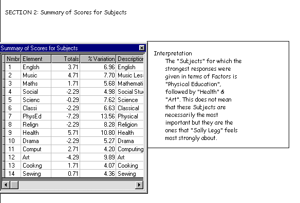
If this were a decision grid (one where all the constructs were aligned in a favorable direction (i.e. high score was at the desired end of the scale). then you could tell whether the strength of feeling was good or bad if the TOTAL was positive or negative. However, in interpreting Principal Component Analysis the sign here does not count for much in explaining the paradigm.
In this grid, however, because there was a mixture of positive and negative
factors (i.e., FUN, BORING etc.) only the strength of feeling could be
measured.
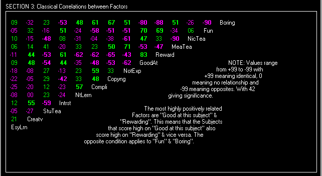
This screen was one of the more interesting because it allowed you to test the meaning of the words used to describe the constructs. We can see here that Sally's definition of Boring was anything that was not Fun, that she does not get Rewarded at and she isn't Good at. These meaningful definitions strengthen your belief that the data provided was valid and not contrived or random. Sometimes "not so readily acceptable" relationships are shown and these you could come back to later in your interpretation. (For example, here we see Not Explained correlating with Mean Teacher).
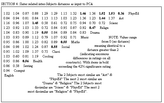
If any significant relationships show up here then you should re-think the problem and ask "What is it that makes This different from That?" or "In what ways are They similar?" (assuming a negative correlation). The table was made up from Slater's inter-element distances that ranged from 0 (no distance) to 2. What I did was to subtract his value from one then change the sign and multiply by 100 so they look like correlations.
It's the Euclidean distances divided by the 'expected' distances. This serves to correct the values to take into account the number of elements and (I think) their deviations from the construct means, i.e. to correct somewhat for the rating scale and how it is being used by the person (I think!)." - Chris Evans - SGHMS (Ingrid2.lis)
This then is the reason why inGridX's PCA differs from most others. These corrections are important because if only classical correlations were used you would not be able to tell when sufficient discrimination had been made between the elements. Also, you would get a plot that isn't as good as inGridX's. The larger the grid the better the inGridX plot and this can be checked by using my example of Australian airfares. inGridX produces a more realistic position of the cities than does say XLSTAT.
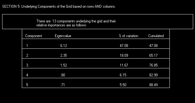
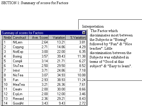
Only the first five component values are displayed because lower levels get confused with mathematical "noise". It is worthwhile checking the first three components to see if their TOTAL is greater than 70% ( which is a measure of stability - .5^2=.7071). If you have any questions, keep them and skip to here.
I am no statistician though will help if
I can. When you say Slater's
element distances give a different treatment
to XLSTAT (which I am not
familiar with, though [I] presume it is
a general stats program) I imagine you
mean the output is different. If
this is the case my guess would be that
the difference is due to inGridX analyzing
columns & rows, whereas a standard
program probably considers rows or columns
independently. ...Bob Green
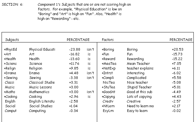
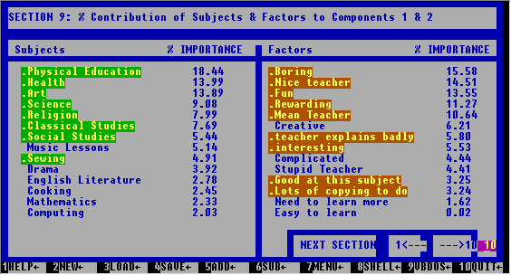
In these contribution tables where you have the same sign you read IS and where the signs differ you read IS NOT. e.g. PhysEd IS NOT Boring; Science IS NOT Fun; PhysEd IS Rewarding; PhysEd IS NOT Complicated; etc.
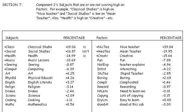
From Ingrid98.e the component contribution screens are now embellished to display significance and an on screen guide is offered to explain significant combinations.
Section 8's image of contributions to Component 3 is similar and is omitted to save space